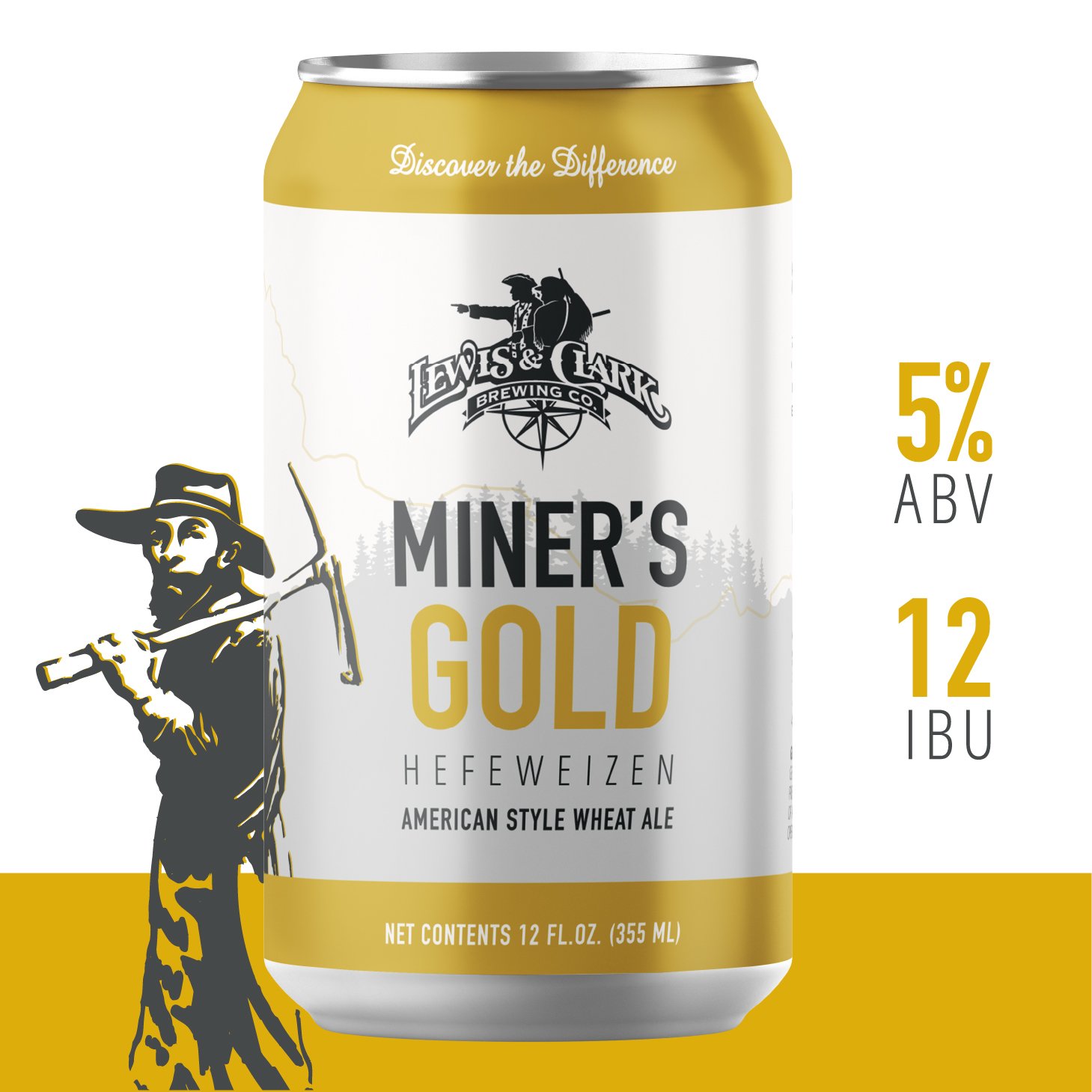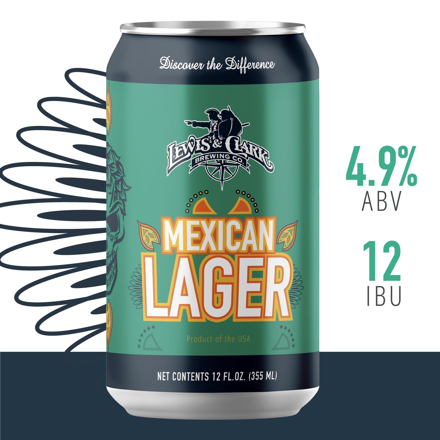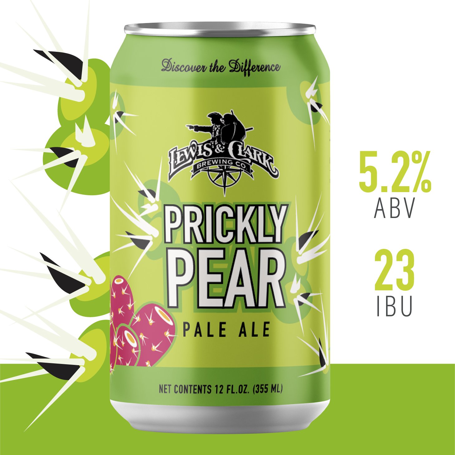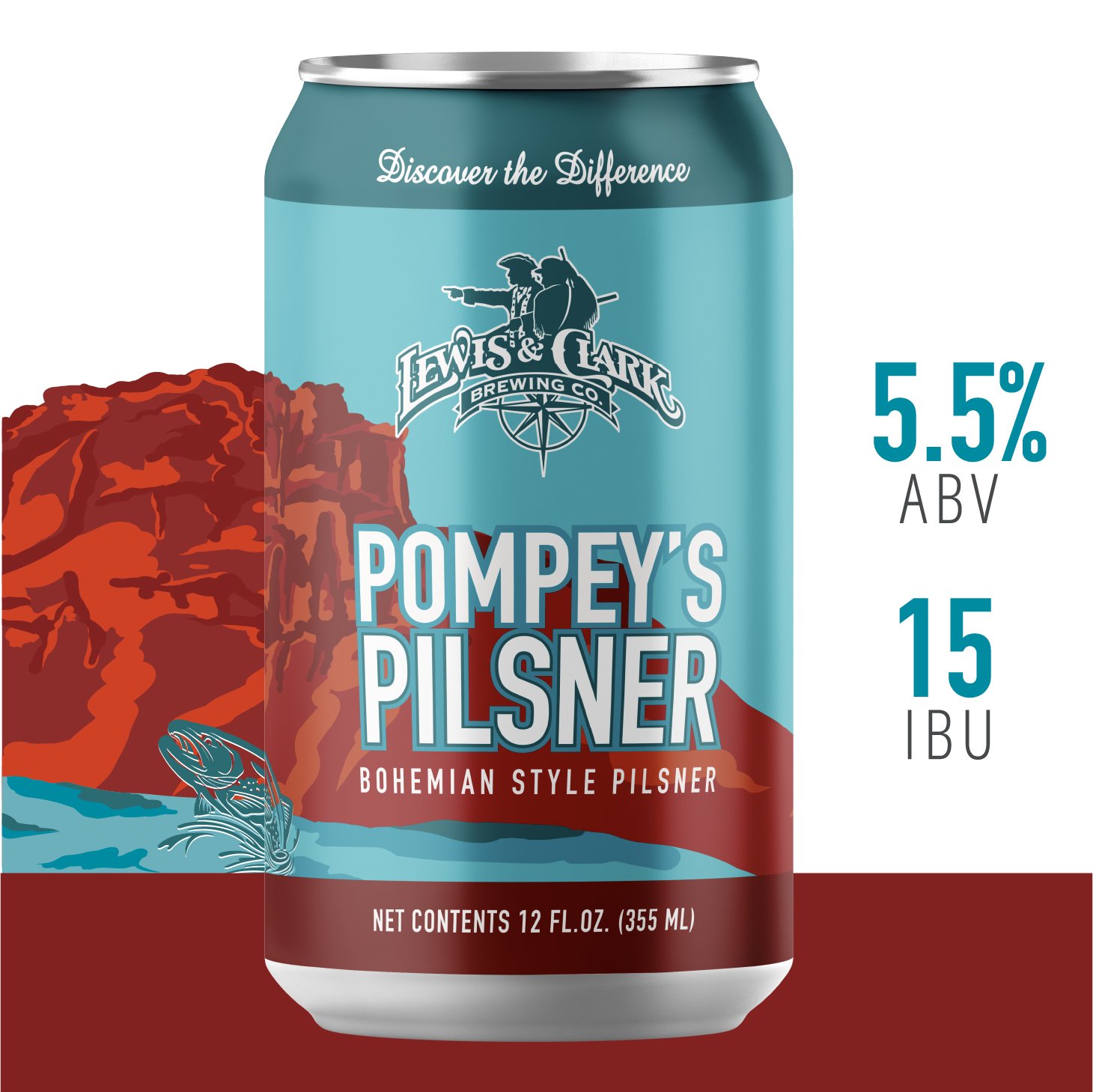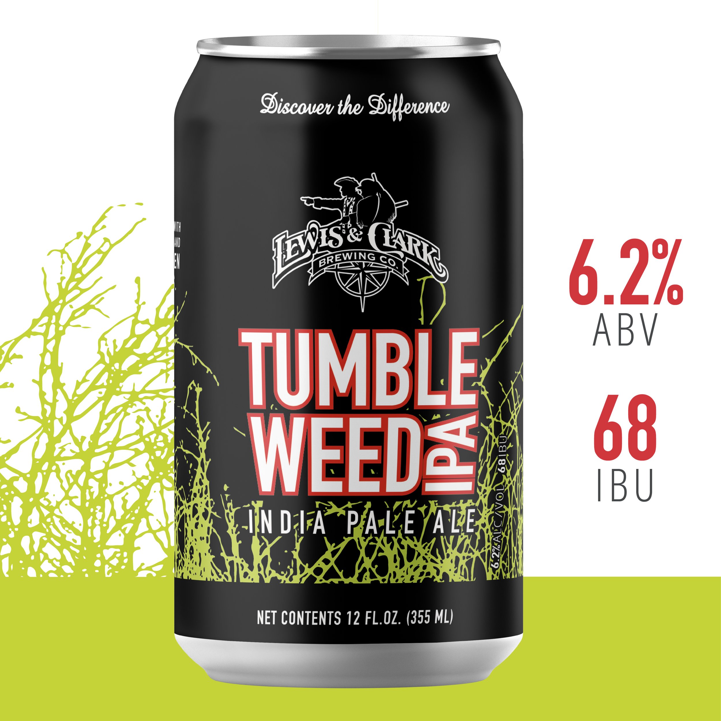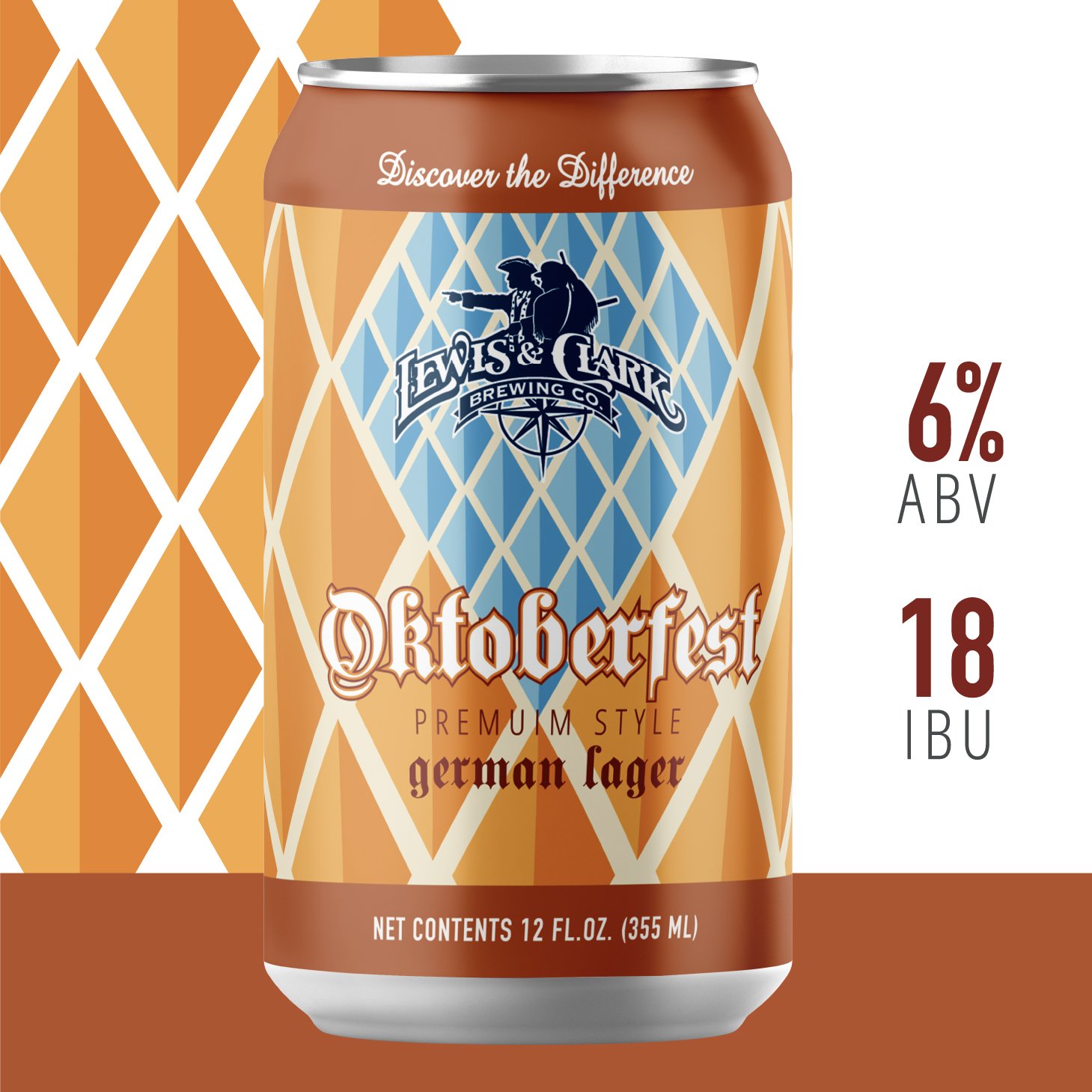

BEER CAN RE-DESIGN
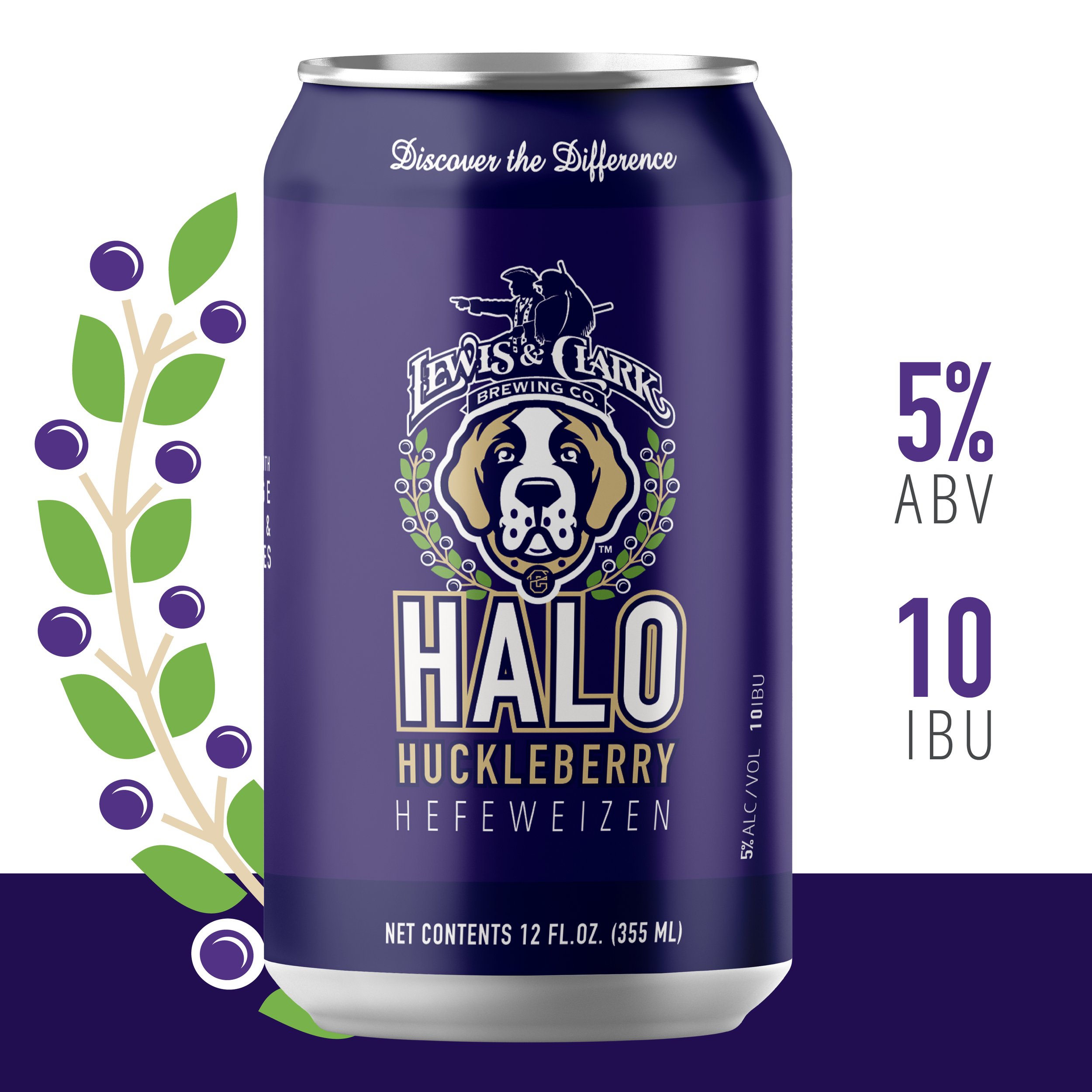
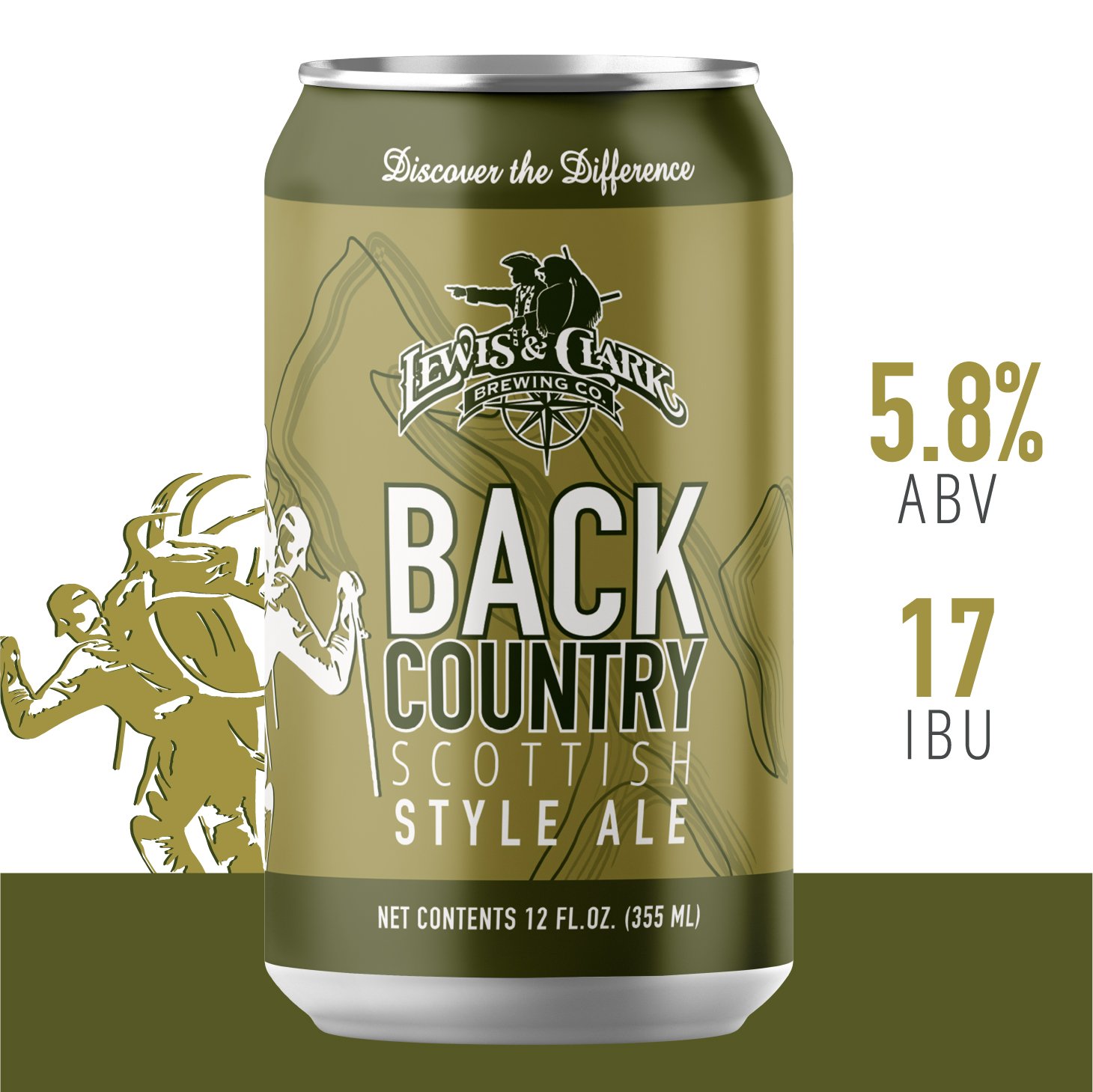
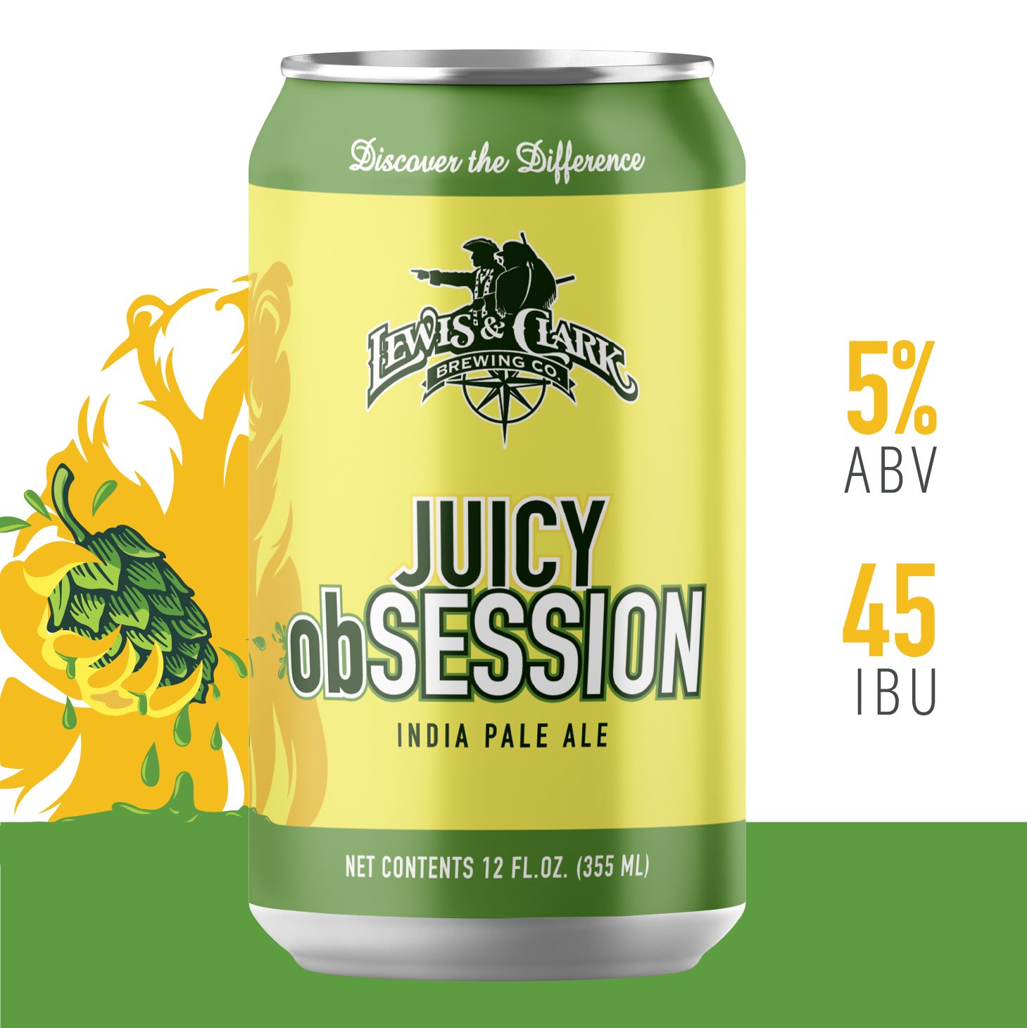
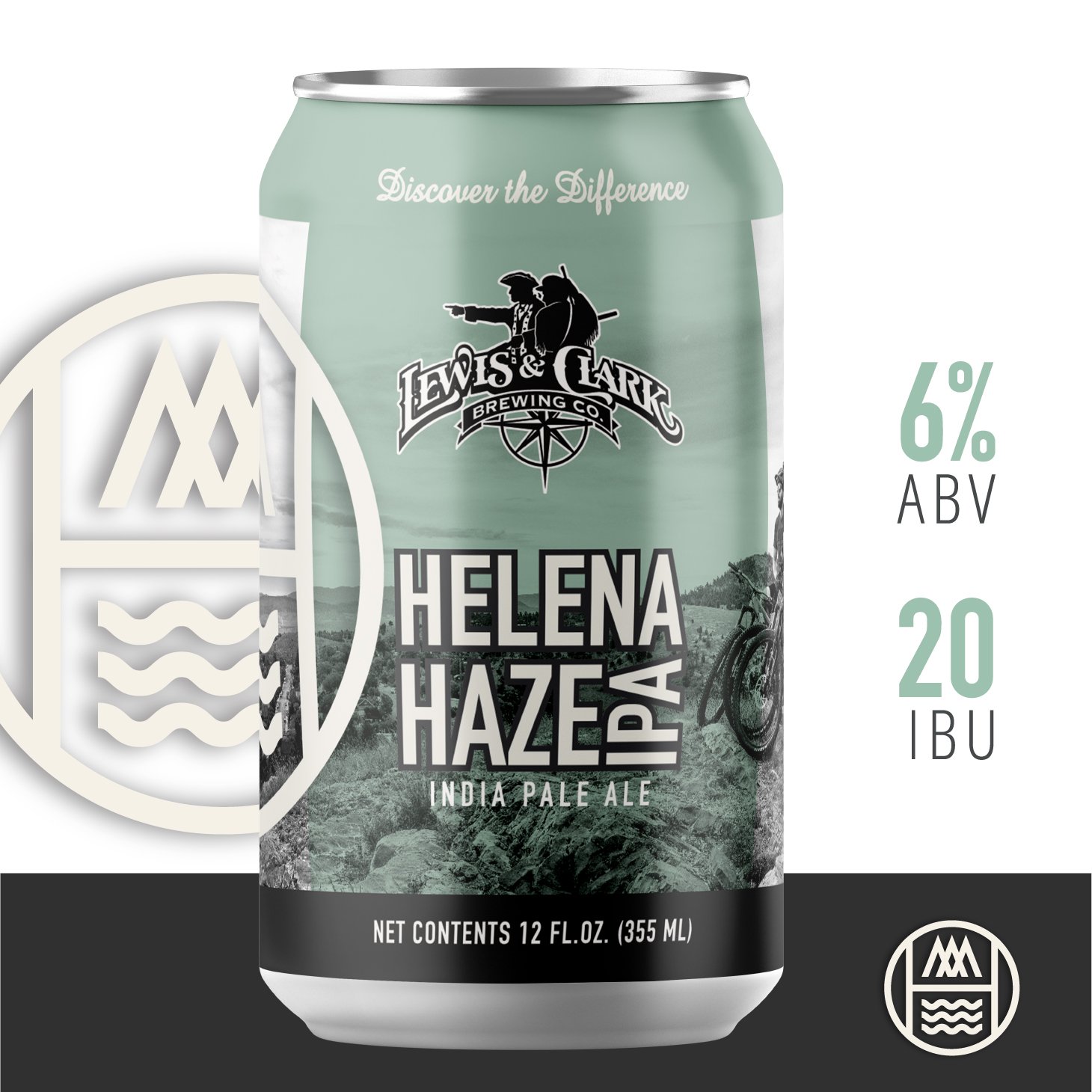
Simplify and modernize are the key words when talking about the Lewis and Clark Brewing Co.’s beer can redesigns. Starting with the well known Miner’s Gold Hefeweizen, I created design standards that would be used across all beers in the future. From new fonts, featured design elements, bolder colors and the signature top and bottom banners, the Lewis and Clark beer cans can now stand together cohesively.
Technical skills include working within different label templates and requirements for different can labeling companies.
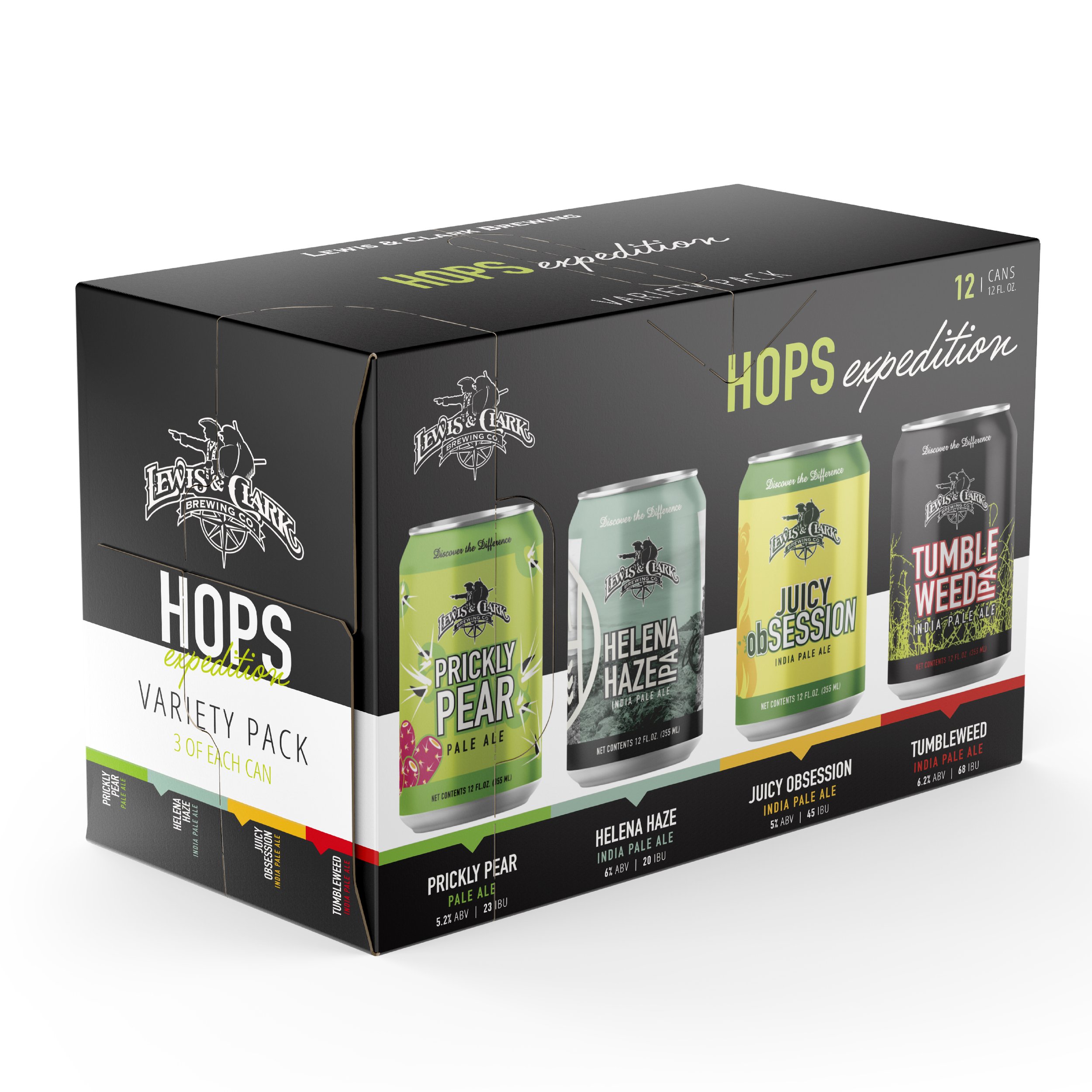
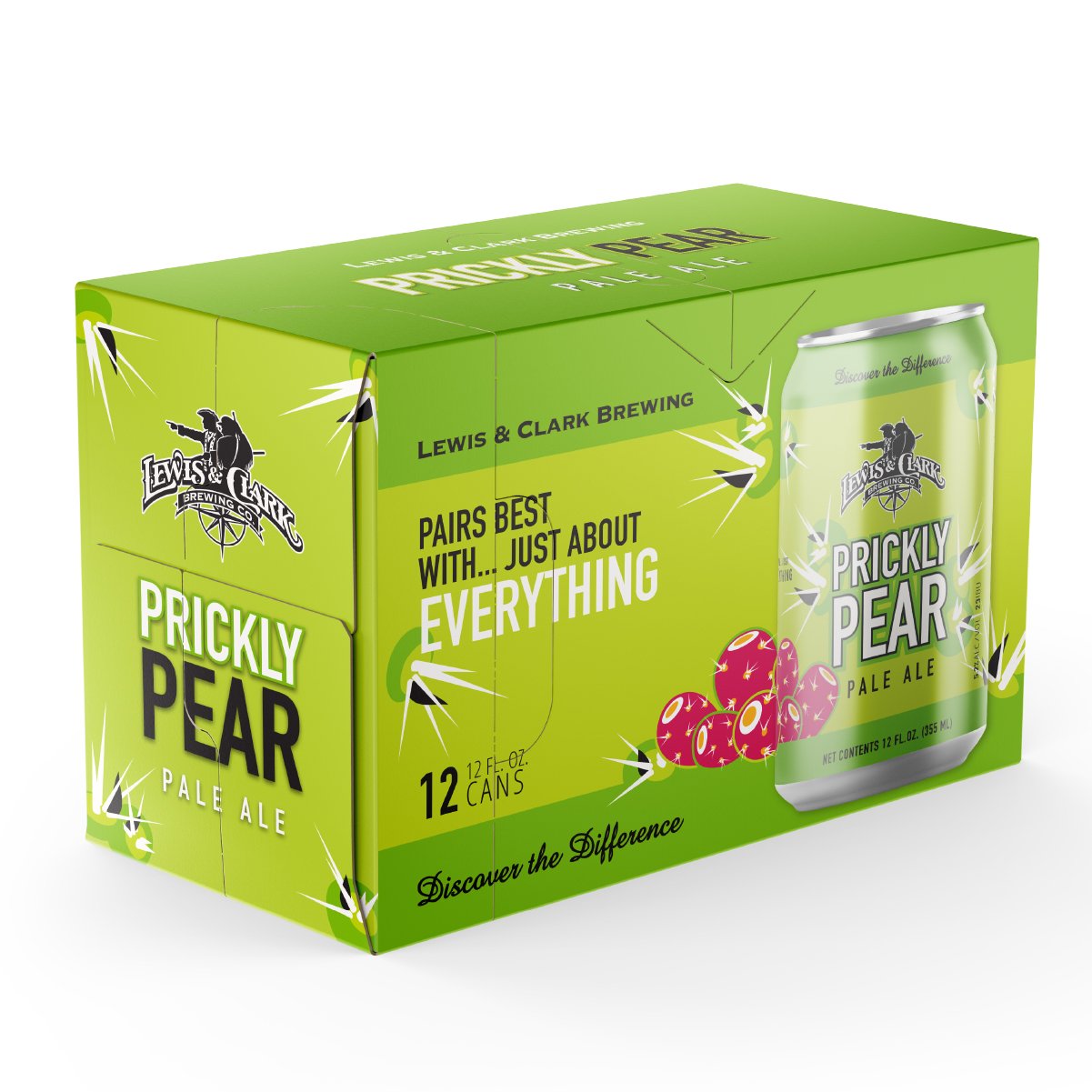
BEER BOXES
Creation of individual boxes as well as mix pack boxes that follow a new standard and aligning with the newly designed beer cans. Highlighting the design elements, consistent fonts and bright colors to easily stand out on the shelves!