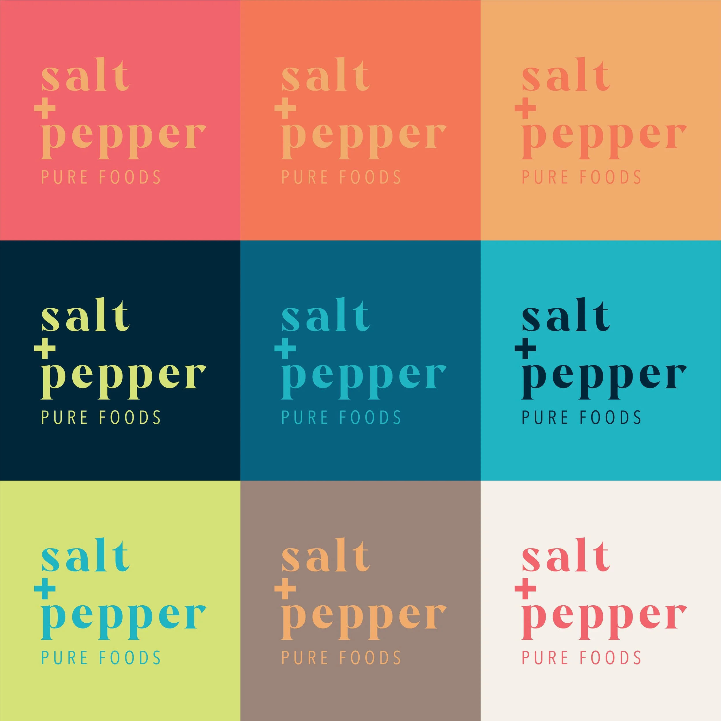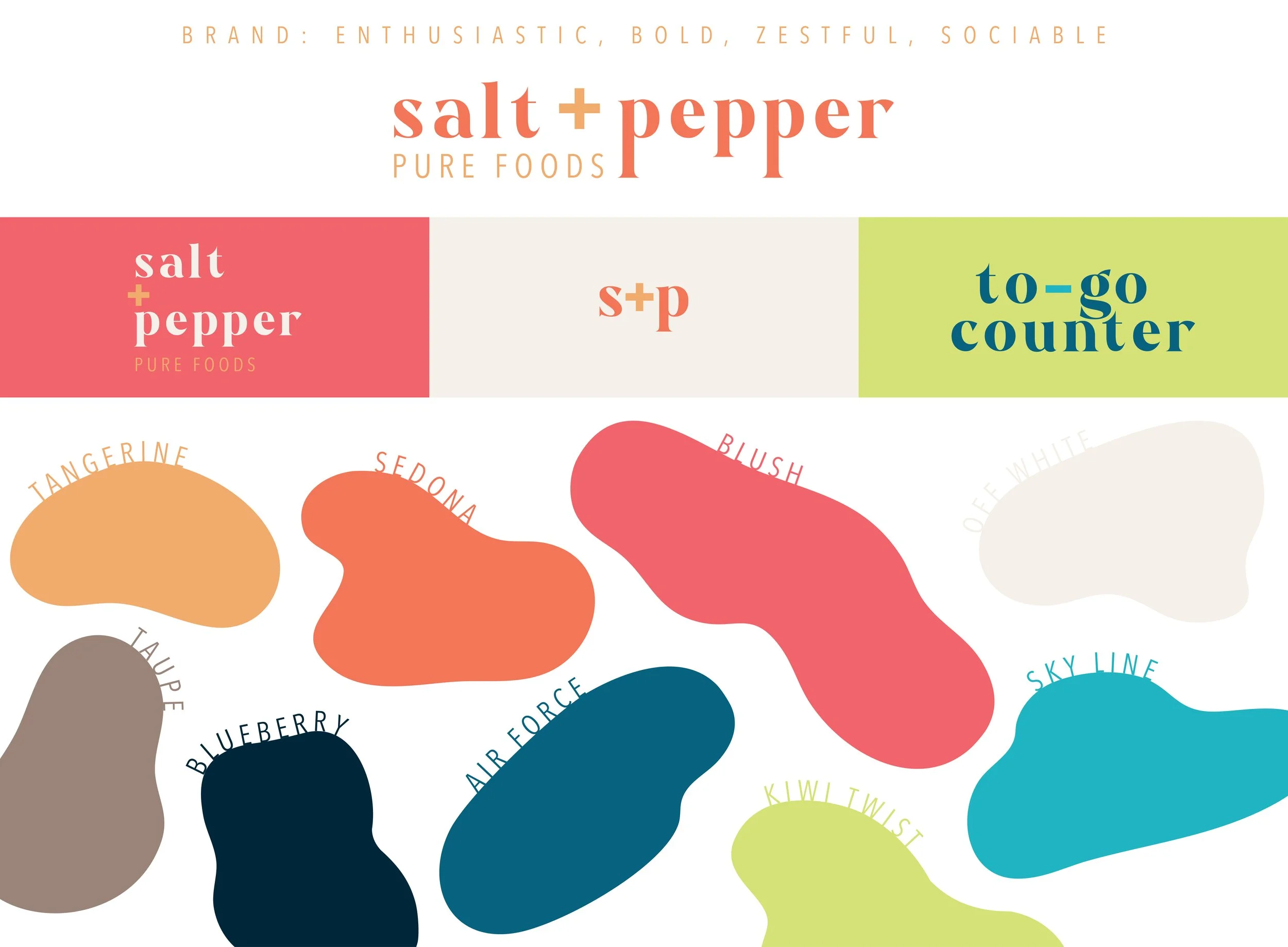
Brand Design
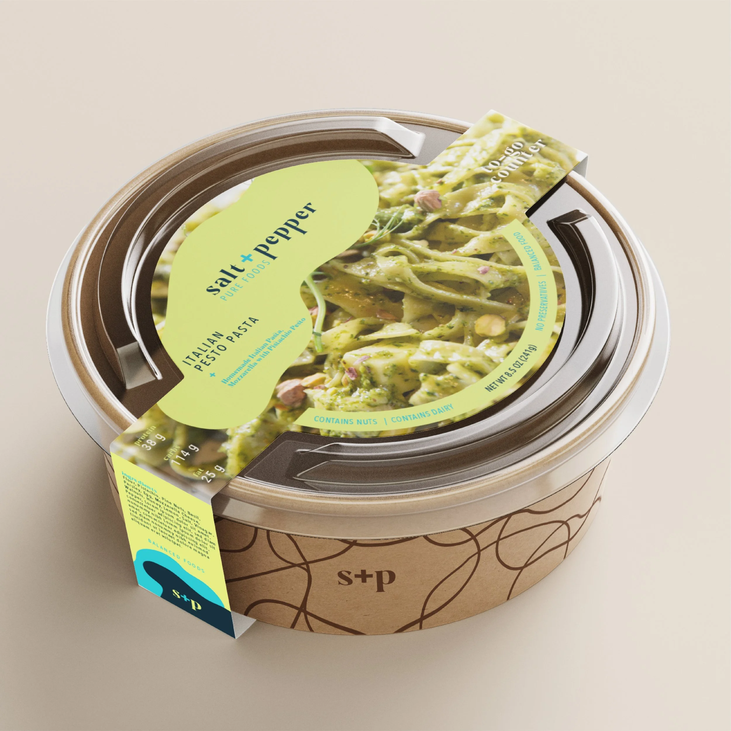
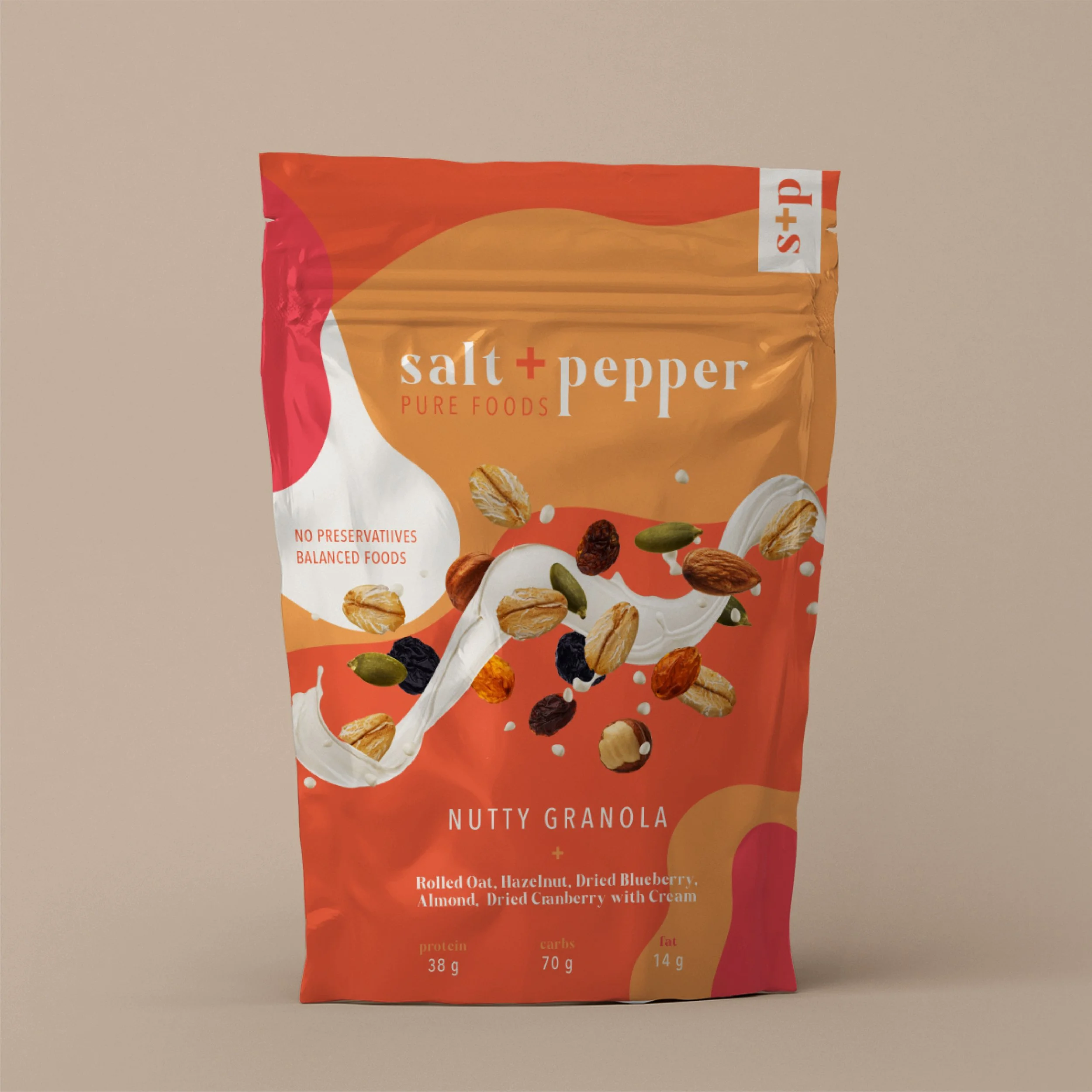
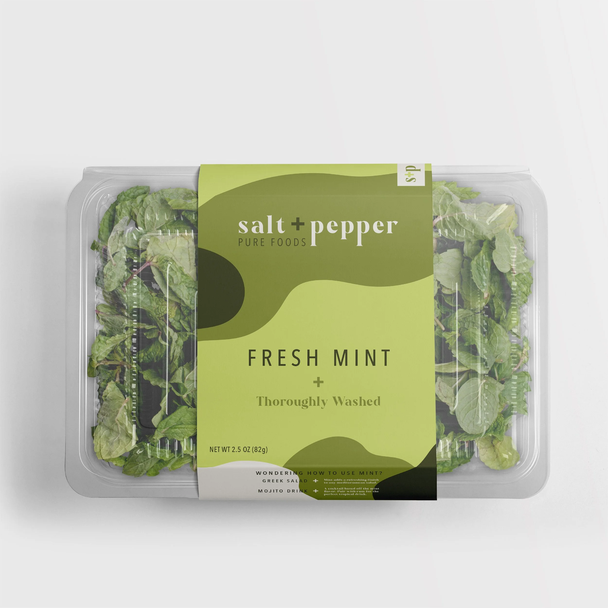
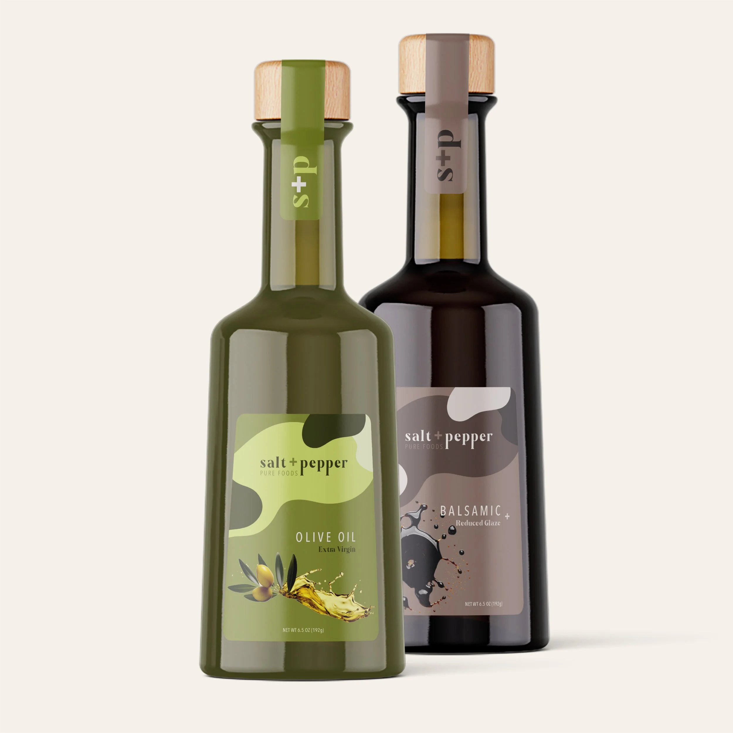
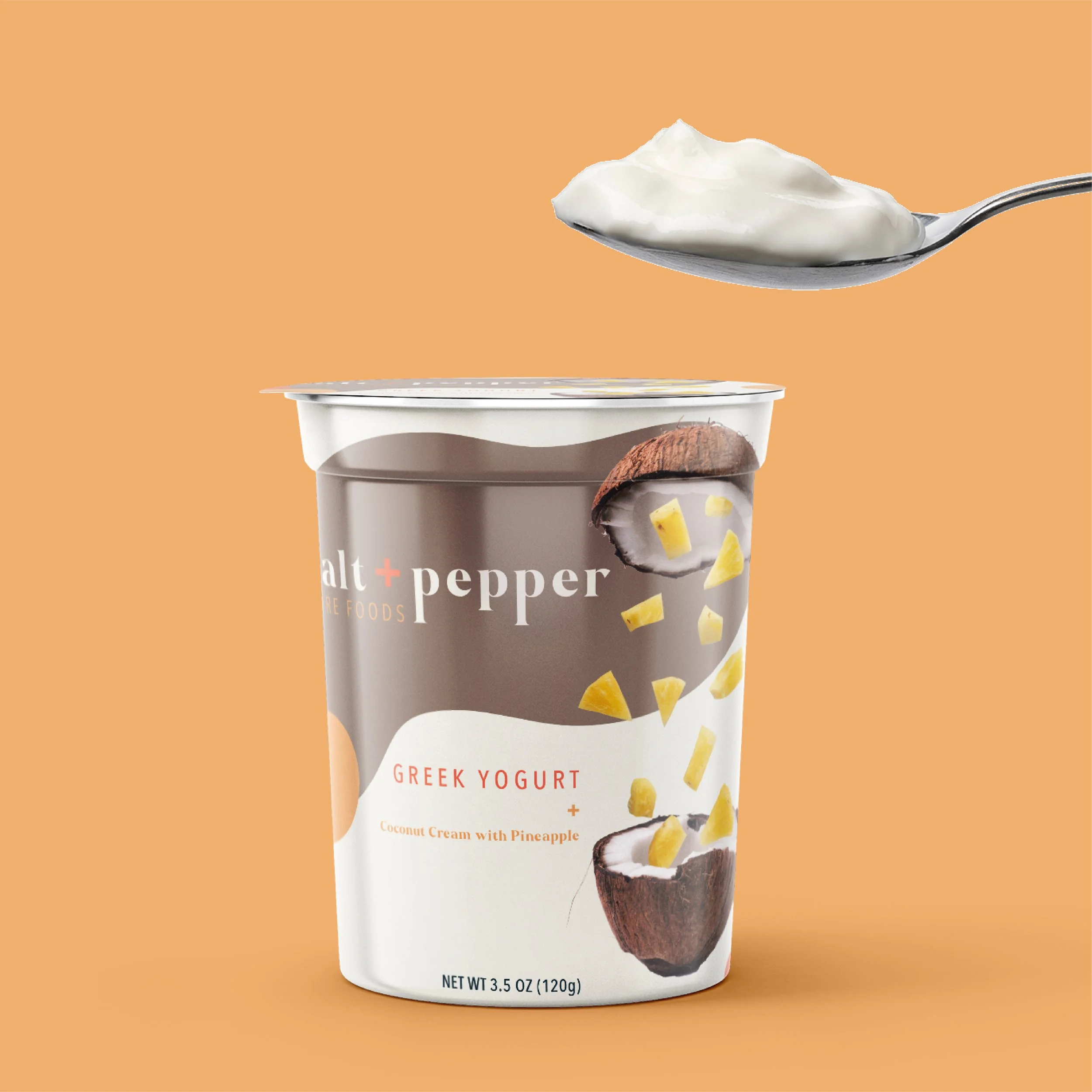
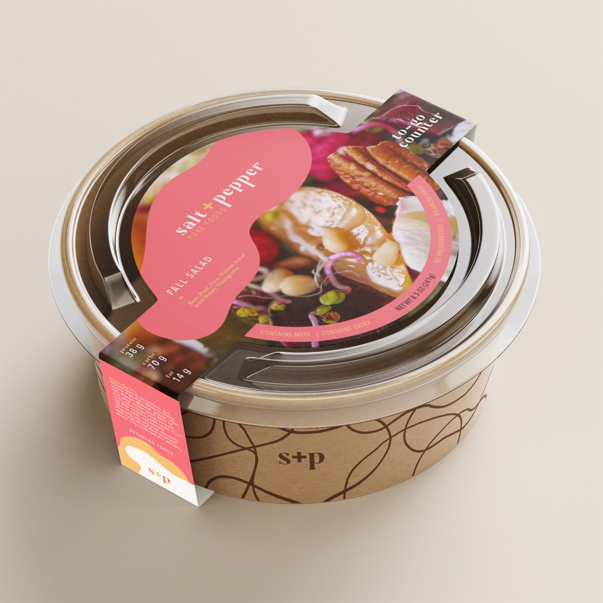
The Salt + Pepper brand is youthful, bold, and dynamic, appealing to consumers who prioritize making healthy food choices. Its vibrant color palette reflects the brand’s energetic personality and pairs effectively with the selected serif typeface. Organic shapes and high-quality food imagery further reinforce the brand’s identity, conveying a balance of playfulness and health-consciousness.
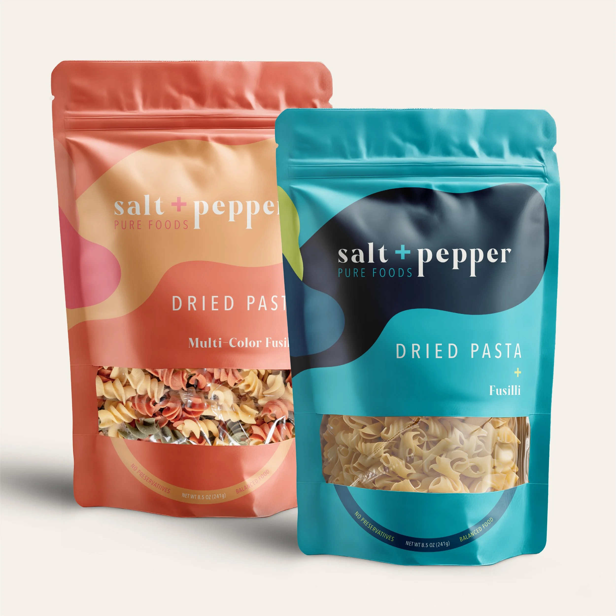
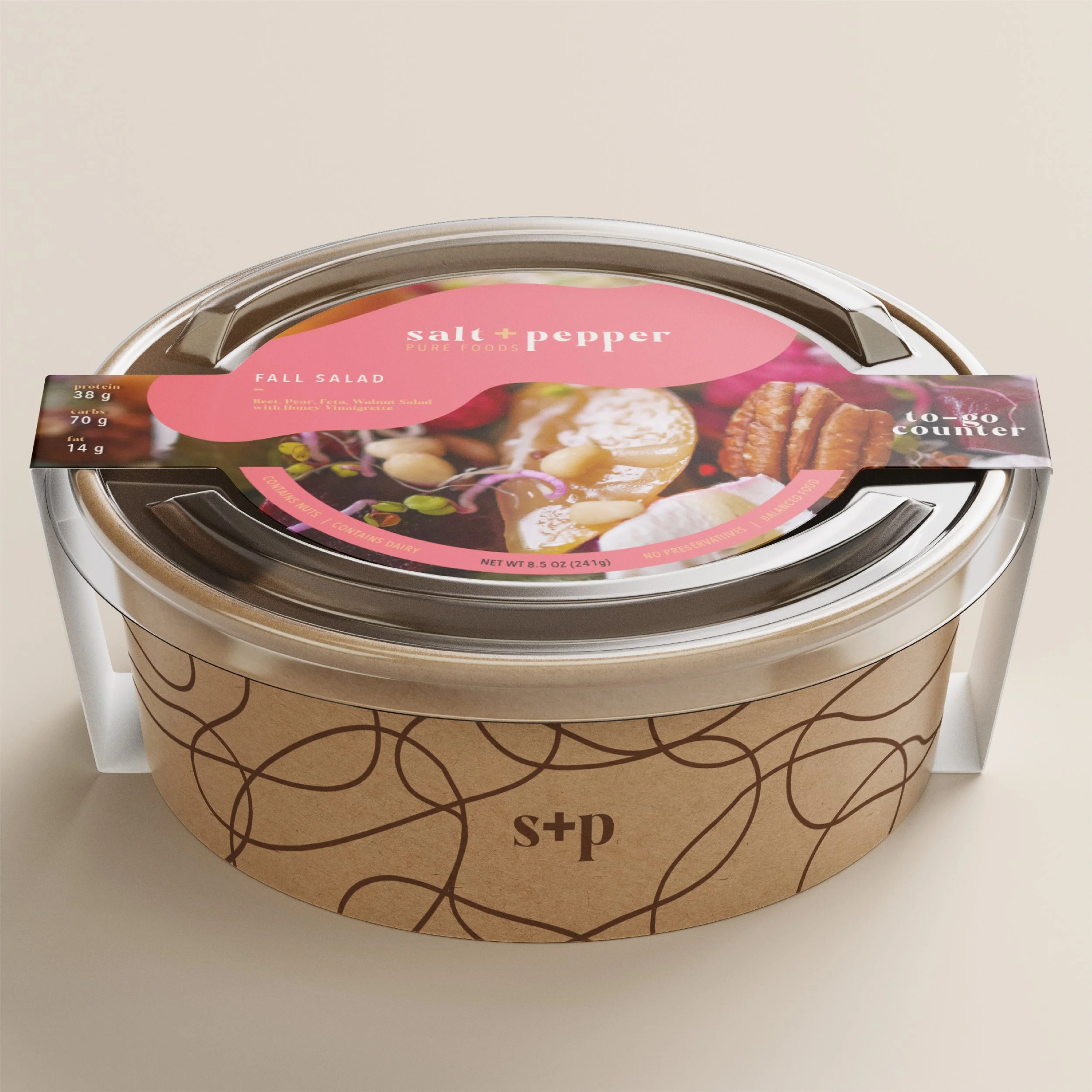
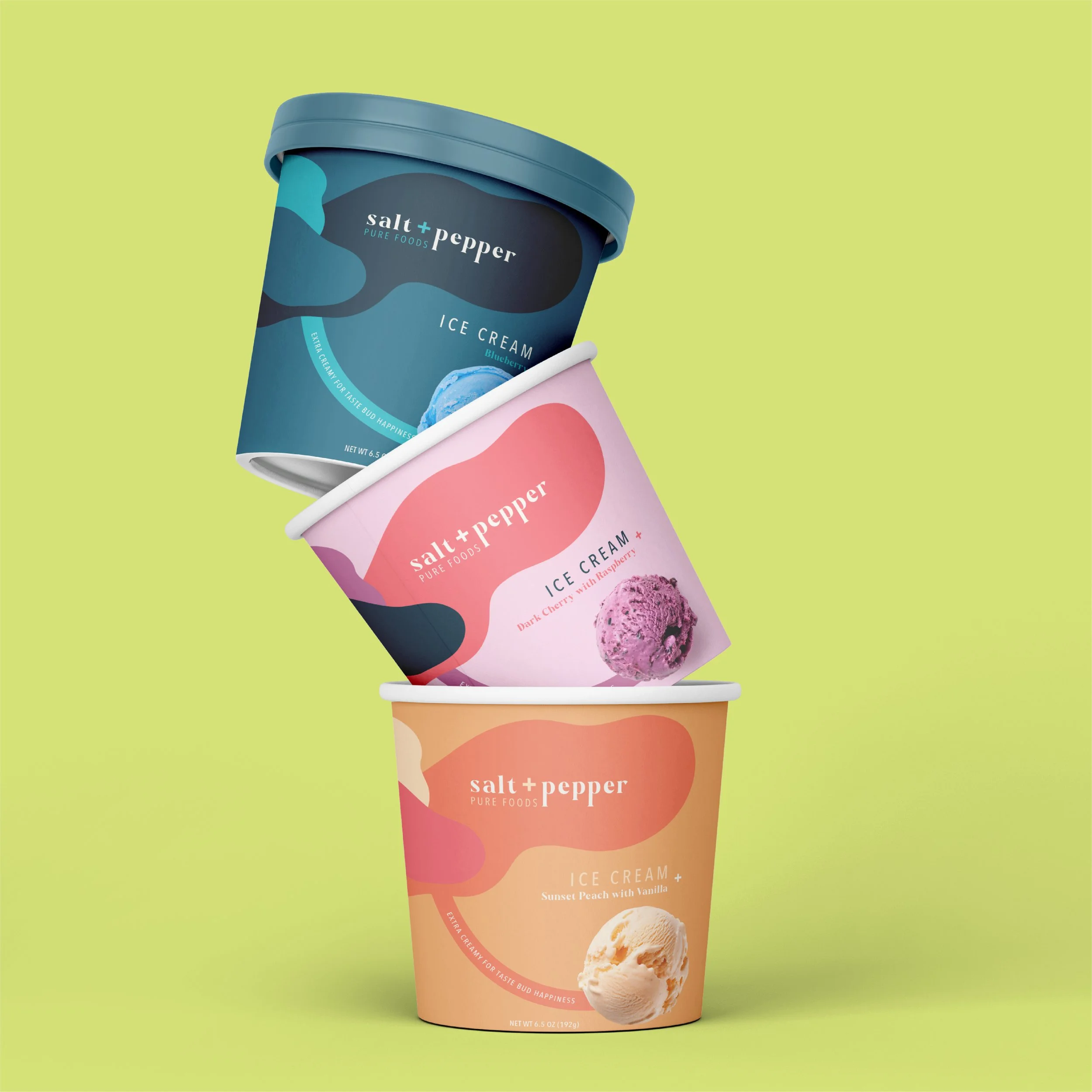
PACKAGING Design
From dried pasta and ice cream to fresh meals and herbs, the packaging design needed to remain consistent with the brand’s fun, bold, and quirky identity. The packaging standards required that the logo always appear within a designated organic shape, with cohesive color usage across all products. Food photography was incorporated where appropriate, while descriptions and ingredient lists were kept minimal to emphasize the healthy qualities of Salt + Pepper foods.